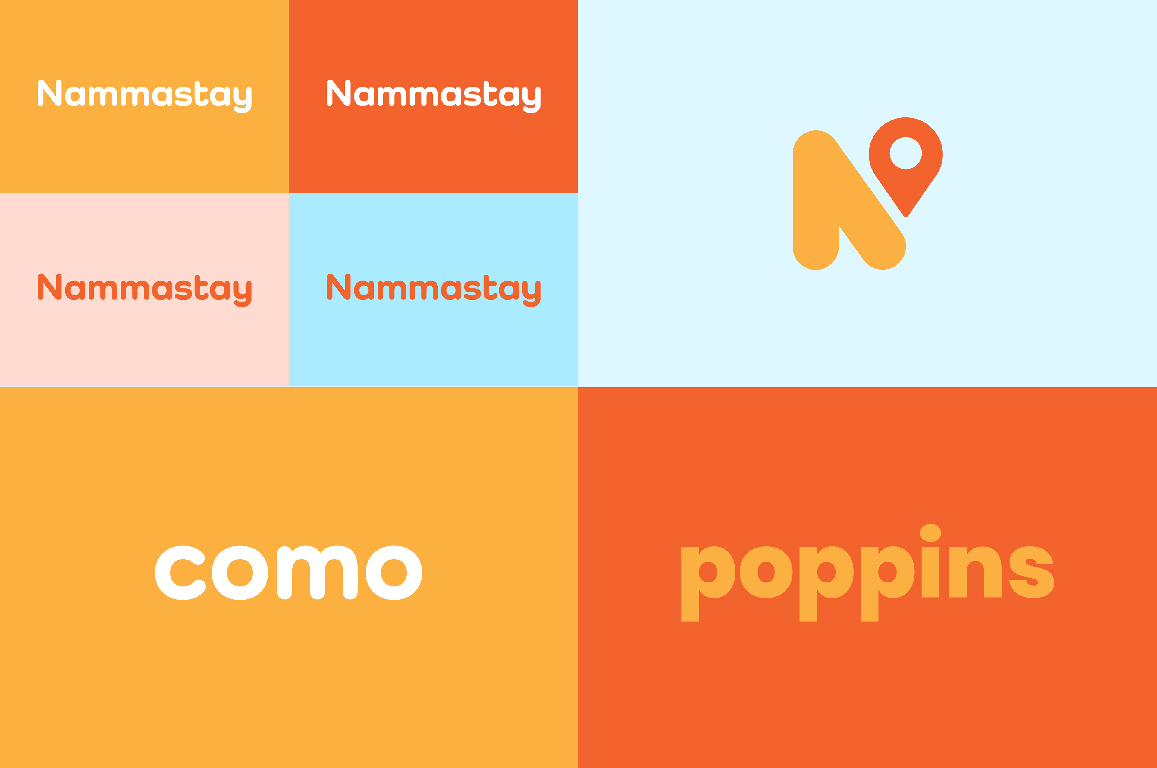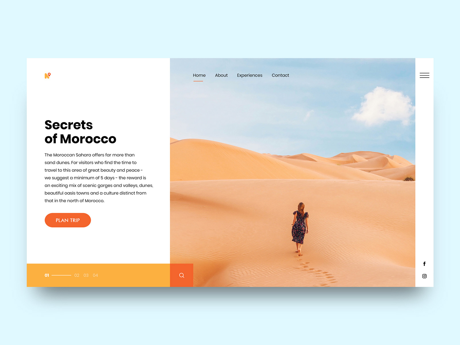
NAMMASTAY
The project was a naming and branding exercise for a travel company offering customized travel experiences. They were seeking a simple and bold identity while staying true to their Indian roots.
THE CONCEPT
Nammastay is a play on the words 'Namaste' and 'Stay', showcasing both the company’s heritage and travel-oriented services. The 'N' monogram is a combination of universally recognizable symbols — the North-directional arrow and a location marker. The brand colours are inspired by the sun, a visual indicator of planning one’s journey.